


New article
Recently updated
Understanding 1/3 octave noise event graphs

Who is this article for?Noise analysts who need to analyse the frequency content of noise events.
Access to the ANOMS Noise Analyst Workbench is required. 1/3 octave data may not be supported or enabled for your noise monitoring terminals.
You can view the frequency and tone of a selected noise event in a set of graphs that display 1/3 octave data.
Available graph types
The 1/3 octave data for a noise event can be displayed in the following ways:
- The HST graph shows a set of 1/3 octave values for each second of the event
- The Max graph shows the 1/3 octave values at the LAmax time (the time when the Leq level reached its maximum for the noise event)
- The Event SEL graph shows the sound energy level for each frequency band
- The 8VA graph shows the 1/3 octave value for every frequency range (16 Hz to 16 kHz) at a selected second of the event
- The 3D graph shows a 3D plot of 1/3 octave data, showing frequency and dB over time
Note: This feature may not be supported by your noise monitoring terminal, or may not be enabled.
Understanding the HST graph
The HST (History) graph shows a set of 1/3 octave values for each second of a given event. The set of values displayed depends on the selected frequency; you can select any frequency range from 16 Hz to 16 kHz. For example, if you select an event with a duration of seven seconds, there will be seven bars on the graph. If you choose to display 1/3 octave data for the 16 kHz frequency, each bar shows the 1/3 octave value at each second for the 16 kHz frequency range; choose 125 Hz and each bar shows the value at each second for the 125 Hz range. The X axis on the HST graph is dB.
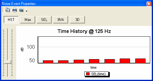
An HST graph showing the 1/3 octave time history of an event at the 125 Hz frequency range
Note: Use the slider on the left of the window to select the frequency range you want to display 1/3 octave data for, between 16 Hz and 16 kHz.
Understanding the Max graph
The Max graph shows the 1/3 octave value at the LAmax time (the time when the level was at its maximum). There are 31 bars on the graph (16 Hz to 16 kHz), and each bar shows the LAmax value at a given frequency range. The X axis on the Max graph is dB.
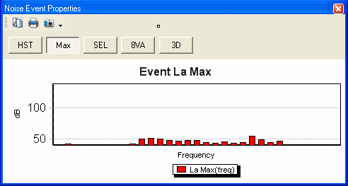
The Max graph showing the 1/3 octave value at each frequency range at the LAmax time of the event
Understanding the Event SEL graph
The Event SEL graph shows the sound energy level for each frequency band. There are 31 bars on the graph (16 Hz to 16 kHz), and each bar shows the SEL value at a given frequency range. To calculate the sound energy level for the whole noise event, convert the values to power, sum the values, then convert back to dB. The X axis on the SEL graph is dB.
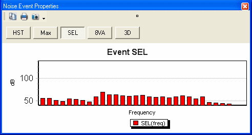
The Event SEL graph showing the sound energy level for each 1/3 octave frequency band
Understanding the 8VA graph
The 8VA graph shows the 1/3 octave value for a set of frequency ranges (16 Hz to 16 kHz) at one-second intervals across the duration of the noise event. For example, if you select an event with a duration of 27 seconds, you can display 1/3 octave data in the range 0 to 26 seconds. Each bar on the graph represents a different frequency range, and displays the 1/3 octave value for that frequency range at the selected second.
This graph is a slightly different way of looking at the HST data: while the HST graph shows all one-second values for a selected frequency, the 8VA graph shows the value of every frequency for a selected second. The X axis on the 8VA graph is dB.
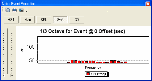
The 8VA graph showing 1/3 octave values across all frequency ranges for a selected second of the event
Note: Use the slider on the left of the window to select the second you want to display 1/3 octave data for. The range you can select is equal to the duration of the noise event.
Understanding the 3D graph
The 3D graph shows a 3D plot of 1/3 octave data, showing frequency and dB for each moment in time across the event.